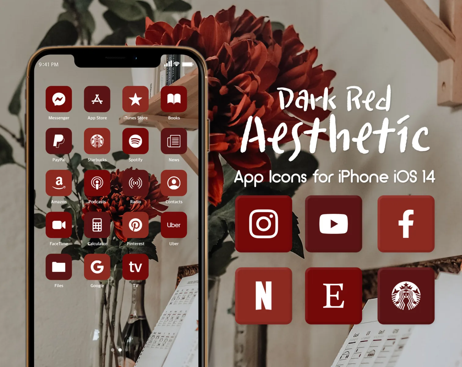
In the latest iOS 14 update, Apple has introduced a new feature that allows users to customize their app icons. This has sparked a trend of users creating their own unique home screen layouts, with one popular choice being red icons. But why are red icons so popular, and what effect do they have on our user experience?
Firstly, it’s important to understand the psychology of color. Red is a bold and attention-grabbing color that has long been associated with passion, energy, and excitement. It is also known to stimulate appetite and increase heart rate. In the world of marketing, red is often used to promote food and beverages, which explains why many popular dining apps such as McDonald’s, DoorDash, and Grubhub feature red icons.
When it comes to iOS 14 icons, the color red can have a similar effect. By using a red app icon, users are immediately drawn to it and are more likely to engage with the app. This could be particularly beneficial for businesses and brands that want to grab the attention of their target audience and increase app usage.
Furthermore, the color red is also associated with urgency and importance. When we see a red icon, our brain automatically interprets it as something that requires immediate attention. This can be useful for productivity apps or reminders, where the goal is to prompt users to take action quickly.
In terms of user experience, red icons can have both positive and negative effects. On one hand, the bold and vibrant nature of red icons can make them visually appealing and memorable. They can stand out on a home screen and make it easier for users to locate and access their favorite apps. Additionally, red icons can create a sense of excitement and anticipation, making the act of opening an app feel more engaging.
On the other hand, the intense nature of red can also be overwhelming for some users. It may create a sense of urgency or stress, which could potentially lead to a negative user experience. Additionally, if all the icons on a home screen are red, it may become visually overwhelming and make it harder for users to differentiate between apps.
The popularity of red iOS 14 icons can be attributed to the psychological impact of the color red. Its ability to grab attention, stimulate appetite, and create a sense of urgency makes it an appealing choice for app icons. However, it’s important to consider the potential negative effects of using red icons, such as overwhelming users or creating a stressful user experience. Ultimately, the decision to use red icons should be based on the specific goals and target audience of the app.
What App Icons Are Red?
When it comes to app icons, there are several popular ones that feature the color red. Here are some examples:
1. McDonald’s: The iconic golden arches on a red background represent this fast-food chain’s app.
2. DoorDash: This food delivery app uses a red icon with a white door symbol, making it easily recognizable.
3. OpenTable: The OpenTable app, which allows users to make restaurant reservations, features a red icon with a white fork and knife.
4. Grubhub: Another popular food delivery app, Grubhub, has a red icon with a white spoon and fork.
5. Chick-fil-A: This fast-food chain’s app showcases a red and white icon with the brand’s name.
6. Eat24: Eat24, a food delivery service, utilizes a red icon with a white plate and fork.
7. Vivino: Vivino, a wine discovery app, features a red icon with a white wine glass.
8. Seamless: Seamless, a food delivery and takeout app, uses a red icon with the brand’s name written in white.
These are just a few examples of app icons that are predominantly red. The use of the color red in app icons can help to grab attention and make the icons easily distinguishable among other apps on a user’s device.
How Do You Change The Color Of Your Icons On iOS 14?
To change the color of icons on iOS 14, follow these steps:
1. Open the “Shortcuts” app on your iPhone or iPad.
2. Select the shortcut you want to modify by tapping on it.
3. Next to the shortcut name, you will see an “Icon” option. Tap on it.
4. A color swatch will appear. Tap on any color swatch to choose a new color for the icon.
5. If you want to save your changes, tap “Done” in the top-right corner of the screen.
By following these steps, you can easily modify the color of icons for your shortcuts on iOS 14.
How Do You Get Theme Icons On iOS 14?
To get themed icons on iOS 14, you can follow these steps:
1. Open the Shortcuts app on your iPhone. This app usually comes pre-installed, but if you don’t have it, you can download it from the App Store.
2. Once you have the Shortcuts app open, tap on the blue “+” icon located at the top right corner of the screen. This will create a new shortcut.
3. Next, tap on the “Add Action” button to add an action to your shortcut.
4. In the action menu, select the “Scripting” icon. This will allow you to add a script to your shortcut.
5. Within the scripting options, choose “Open App” as the action for your shortcut. This will open a list of apps installed on your iPhone.
6. Select the app you want to customize by tapping on it. This will add the app to your shortcut.
7. After selecting the app, tap on the ellipsis (three dots) located at the top right corner of the screen. This will open a menu with additional options.
8. In the menu, select “Choose Photo” to customize the app icon.
9. You will be prompted to select a photo from your camera roll. Choose a photo of your desired theme icon.
10. Once you have selected the photo, you can optionally customize the shortcut’s name by tapping on the shortcut’s default name at the top of the screen.
11. tap on the “Add to Home Screen” button at the bottom of the screen to add the customized shortcut to your home screen.
By following these steps, you can customize the icons of your apps on iOS 14 using the Shortcuts app. Repeat the process for each app you want to customize, and you can create a personalized and themed home screen for your iPhone.
Conclusion
The use of red icons in iOS 14 can have a significant impact on user behavior, particularly in dining apps. The color red has been shown to increase appetite and even caloric intake, making it a strategic choice for food-related applications. This can be seen in popular dining apps such as McDonald’s, DoorDash, and Seamless, which all utilize red icons to attract and engage users.
Additionally, the use of red icons can create a sense of urgency and excitement, encouraging users to take action and order food quickly. This can be especially effective in a fast-paced, on-demand industry like food delivery.
On the other hand, it’s worth noting that the color red may not be suitable for all types of apps or industries. For example, a calming or wellness app may opt for a different color scheme, such as blue, to evoke feelings of relaxation and tranquility.
Ultimately, the choice of icon colors in iOS 14 should align with the app’s branding and objectives. Red icons can be a powerful tool in capturing attention and stimulating appetite, but it’s important to consider the overall user experience and the specific goals of the application.

